
Hi and welcome back.
Those who read the last blog and have never drawn before may have done some drawing, out of curiosity. If you did, how was it? Enjoy it? Hate it? I guess if you really hated it you wouldn’t be reading this.
I have to admit I found it difficult to go back in time and draw something I hope I’ve picked up enough experience not to do ordinarily. Its like trying not to ride a bicycle when you’ve learn’t. Yoda would say Scarily comical drawing turned out it has.

Maybe you’ve repeated my mistakes, created your very own or perhaps you’ve got a fabulous drawing you’re proud of and discovered a hitherto undiscovered talent. If you made mistakes, did you work out what you’d done? (I do appreciate that maybe no one picked up a pencil).
I don’t how your drawings have turned out, so I can only reference my timewarp drawing and if you recognise similar issues, I’m going to try to give you some advice on either how to avoid the issue, or if its a technique which doesn’t usually work with portraits, explain what it is and why it should be avoided. I’m only going over the main issues at the moment.
Positioning of the subject
Unless you’re going for a ‘thirds’ picture where you’re intentionally leaving lots of space to one side of the subject, its best to have the subject in the centre of the paper. Probably best to avoid chopping of the top of their heads too, as I’ve done above. More on ‘thirds’ in a later article.
Lines
Unless you play Borderlands a lot, you’re probably not used to seeing people with dark lines surrounding their features. You can use them as guides, but they should be removed as best as possible before you’re picture is complete. for this reason, its best to use a 2b or 3b pencil to lightly add them. Sometimes, you cannot help but avoid using them, e.g. when the edge of the subject’s face is the same tone as the background and it looks like they’re fading into each other. (A trick to get around this is to change the background colour).
I find that ink drawings are the exception to this and I tend to use lines in them, but only because it suits the medium.
Positioning of the subject’s features
Here, I mean eyes, nose, mouth and ears. I’ve exaggerated not putting the eyes in the correct place. Most people, (me among them at one time) think that a persons eyes are 3/4 of the way up the face. They aren’t. They’re just above the centre of a face. If you have a protractor handy, try positioning one of its points on Meghan’s chin, and then spin the other arm so its positioned in the middle of the eyes. Then take the first arm off of the chin and rotate it around so its at the top. See how close it is to the top of Meghan’s hair? Its sometimes difficult to judge this when people have big hair.

From the line where the eyes are, the nose takes up a quarter of the full length of the head. The mouth is roughly 1/5th of the length of the head when measured from the chin. Scarlett’s head is inclined forwards here so you’re seeing more hair than you would normally see.
I thought the eyes being situated halfway down the head was weird, and it took me a little while to get used to positioning them correctly.
Flatness
There is no tone anywhere in this picture. Tone helps your brain recognise a three dimensional image from what is actually a two dimensional picture. If its not there, everything looks flat. Basically you need to show where light is not present fully.
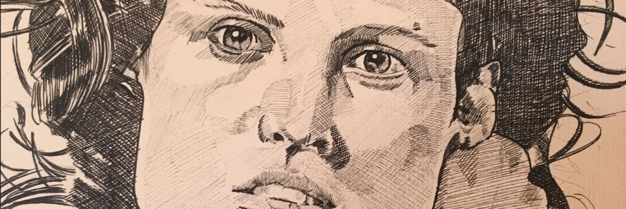
The Eyes
Eyes are kind of almond shaped. Irises are circular, so unless someone has their eyes wide open, you won’t see the top and bottom of their irises.
No catch light has been used. This is a trick to make eyes look like, you guessed it – eyes, rather than dark shapes. Usually it’s one but sometimes its more, very bright (white) areas in the eyes. Usually these are on the pupils, but it depends where their eyes are looking and where the brightest light source is coming from. You also see reflections of whatever is in front of the subject, though its more apparent in the lower half of the eye which is usually drawn lighter.
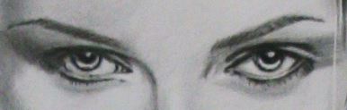
If you know manga, then you’ll be used to seeing exaggerated catch lights in the character’s eyes. Finally eyes tend to be darker at the top than the bottom because of shadow from the upper eyelids.
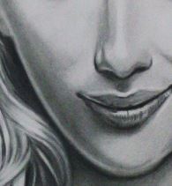
Mouth
I have of course exaggerated the width and size of Meghan’s mouth. The other thing I’ve done is define each tooth. Usually when you see portraits, you’ll see that teeth are almost blended together with very little marking to show individual teeth. I usually show some because I think otherwise it can look like a subject has a mouth guard in.
Hair and eyelids

Usually you’d try to use lines here, not to define individual hairs but to give an impression of the direction of the hair.
Scuffing
Look carefully and you’ll see there’s a sort of ‘dirty’ look to the picture. This was caused because I didn’t cover the picture as I drew it. Essentially you get a piece of paper – tracing paper if you can, to cover the part of the picture that you’re not drawing. If you do this you’ll avoid the edge of your hand scuffing the drawing.
It would be great to know how your pictures turned out. If you have comments, questions etc, or would like to ‘like’ this article or follow it so you don’t miss the next one, you should be able to find buttons on screen to let you do this.
Next time …
Starting a picture of Meghan, showing every stage. 
Have a good week. Ian.
