Art, How to draw portraits, Learning how to draw, Portraits

Drawing a Portrait – Stage 6

Hi,

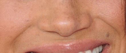
This post kind of wraps up the Meghan Markle picture.

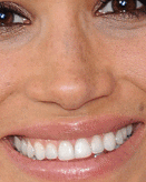
If you’ve been following along, the picture had got to this:

IMG_3290_crop

There were a few things I wasn’t happy with, and if the truth be told, its very easy when drawing a picture to never be completely happy with it.  There’s always a thought that “oh if I just adjust that slightly” but more often than not it turns to overworking the picture and potentially wrecking it, which I’ve done in the past.

Nowadays I get the picture to this point and call it a version.  I know that redraws are often better than the original version, and part of this is the fact that in your mind, you are now familiar with the subject’s face structure and can manage to replicate it, but better and with less working, whilst contributing less wear to the paper which gives a smoother look.

Something else I do is leave a picture for several weeks without doing anything to it, and then view it again with ‘fresh eyes’.  Issues leap out of the page at you – not necessarily things that a casual viewer would be able to detect but that nevertheless distance it from being correct.

That opens up the question of what you want at the end of the day – do you want something that is so photo-realistic that viewers think it is a photo, and in doing so remove the opportunity of an artist’s impression, or do you want something that goes past a copy of the photo and produces a new picture from the source.

When I look at my ink work, there is no way that it is even going in the direction of photo-realism but they have a ‘grab’ factor anyway, or at least to me.  (Not that I’m egotistical enough to think that my pencil pictures are).

‘Grab factor’ is that certain something that makes you take a second look at a picture.  I think in this visually deceptive age, that people have become unconsciously blase about what they see in art and film.  What can be accomplished with digital art and CGI processing in film is light years beyond what it was 10 years ago.  The recent Star Wars films use CGI for several actors who had sadly passed on, and the finished shots were great.  What can be done in a fraction of the time in these formats still takes a pencil artist a long time, but the effort becomes understated because people now think that it’s easy to do.

Perhaps I’m moving in the direction of ink because it isn’t so easy to get right and it distances me from the batteries of artists doing photo-realistic pencil.  Not in a ‘better’ way – just different, and to me more individual.

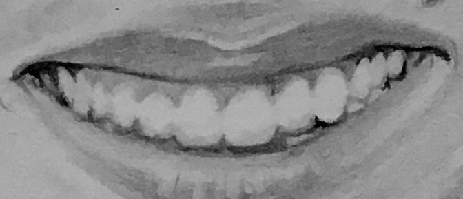
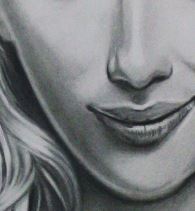
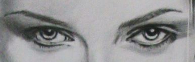
Anyway, back to Meghan, who now looks like this:

IMG_3301_crop_enhance

So what’s changed?

IMG_3290    IMG_3301_crop_enhance

Ignore the fact that the left hand pic is darker – it just that I’ve balanced the light in the photo of the latest version.

  • A medium tone background has been added.
  • The hair has been darkened and has had (light) highlights added.
  • The edges of the hair where it meets the background, has been defined.
  • Stray hairs have been added.
  • Skin tone below the neck has been darkened.
  • The eyes, top eyelids and eyebrows have been overlaid with softer (darker) pencil.

I think the darker background works better.
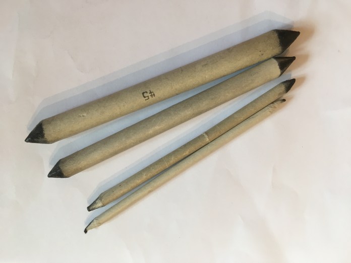
The hair darkening was a response to my thought that in the original photo Meghan looks like she has black hair, but my stage photo made it look like she’s a brunette.   I think it could still be made darker.  The technique I used was to apply layers of tone over the hair, add single lines to provide some definition (but not every single hair – less is more with this).

The added tone in the background is a little rough, but the paper has had so much eraser work on it, that its chopped and far from the pristine Bristol smoothness it was in when I started.

I’m happy with this as a version.  A new version might be better but to be honest I need to do something else – this picture’s now been in development a little too long.

So what do you when the picture’s finished?
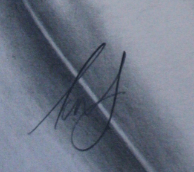
Signing

It’s become ‘unfashionable’ to sign work, but there’s nothing stopping you – I always think it tells the world you drew it when they ask whether you really did.

example signature

Protecting it

Not the putting it in a mission impossible style bank, but applying lacquer to prevent it accidentally being smudged.  The easiest way to do this is cheap hairspray.  Good old PoundLand hairspray is perfect.

Hairspray is simply glue with perfume added, and carried in gas as you spray.  You can buy expensive hairspray if you want but it’ll have more perfume in it, which may darken the picture.  You can also get fancy lacquer spray in art shops or online, but its simply the hairspray without perfume and is usually expensive.  Don’t spray the picture too much – it’ll take a long time to dry and may bleed what you’ve drawn especially if you’ve also used ink pens.

Displaying it

Either display it in a portfolio book – orderable online, in art shops or Staples, or frame it in a picture frame.  If you buy a portfolio, and are not using hairspray to bond the pencil, don’t buy the cheapest one you see – after a while, you’ll find that unprotected pencil drawing produces a shadow on the plastic sleeves and while doing so, lightens the picture.

This is an example of a portfolio book:

IMG_3303


If you’re putting it online, take care to add a mask on top, including the words “Copyright” and your name.  That way its more difficult for people to download the image and print it off.  If you want people to be doing that, they should be paying for the privilege.  Sites advertising works for sale add their own masks to safeguard the picture from being downloaded as is.

Next (from you)

‘Next’ is up to you.  Find something you want to draw, apply the techniques here if you want, and start discovering how to draw portraits.  The more mistakes you make the better.  You’ll learn what works, what doesn’t and how to apply fixes.  Try to write down the process in a journal if you can, for review later, or better still stage photo your work and add notes as text. for things that have worked, things that didn’t and the techniques you’ve used.

Next from me

Next from me is a long overdue commission for one of my friends, and on here a tutorial on pop-art picture drawing.  If you fancy seeing that, I look forward to sharing the process with you next time, or at the least the first stages, of a colour pop-art picture of Gal Gadot’s Wonder Woman.

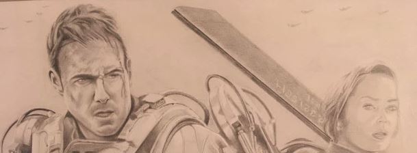
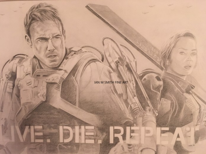
This is an example of a pop-art picture of the farewell scene in Casablanca:

IMG_3302

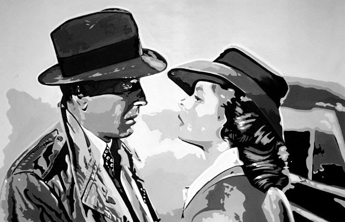
If this makes no sense at all, IMDB reviews the multi Oscar winning film here.

If you’re working on your own pictures it would be great to know how they’re turning out.  If you have comments, questions etc, or would like to ‘like’ this article or follow it so you don’t miss the next one, you should be able to find buttons on screen to let you do this.

NB: The LIKE and FOLLOW buttons and links are hidden (a bit).  If you click the button with the three horizontal lines at the top of the blog, you should then see them.

Thanks for reading this, best of luck with your drawing and I look forward to seeing you next time.

All the best.  Ian.  smiley-1306301-639x623


Standard
Art, How to draw portraits, Learning how to draw, Portraits

Drawing a Portrait – Stage 5

Hi,

If you’ve been following this series, you’ll have seen how to draw a portrait of Meghan Markle to the stage shown below:

Meghan stage 4

This blog takes things a little further.

Meghan stage 4IMG_3290_crop

So, what’s changed?

  • Her hair and eyebrows have been more clearly defined and shine has been added.
  • Blemishes have been added.
  • Her teeth have been lightened.
  • Tone has been applied to the area below the left side of her lower lip and centre of the chin.
  • Material shadowing has been added to the shirt.

Hair definition

I’m not so good at free drawing hair but find that to make it look right, less is actually more.  I feel that if you define every strand it complicates the picture and makes it look forced.   They key is to get the hair tonally correct – light where it’s light and dark where it’s dark.

The light should follow the contours of the hair – where it’s closer to (you) it should be lighter.  If you think of it as the crest of waves at sea, that’s where the lightest area is.

As an example, in the shock of hair close to the right cheek, the hair bows out above her eye.  The fastest way to apply the light is to draw the hair in and then pull it out with a manual fine tipped eraser using a lot of pressure at the peak (or centre) and lessening as you move away in each direction so that the lighter area fades away slowly.

You may find this easier if you start off by drawing the lines in gently with a harder pencil so the lines are light, then go over the lines with a softer pencil.  Keep doing this until you’re happy with the tone when compared to the photo.

IMG_3290_crop2

Overall, I’m struggling with darkening down the hair enough – Meghan’s hair is very dark and here it looks mid toned, so if I did the picture again I’d concentrate on making the hair darker straight away.

Tearing

This picture has been drawn on what is called Bristol paper.  It has an almost photographic paper feel to it’s surface.  A problem with ultra smooth paper like this is that it can get ‘tired’ – overwork it too much (like trying to make the hair darker after a lot of work has been done) can tear the paper, and there’s nothing you can do once that’s done.  You get similar damage over a wider area if you’ve gradually worn away the surface, which you can do by drawing pencil in, then erasing and so on.

Torn or worn paper has more heavily grained paper at the surface and it accepts pencil a lot more readily – if you try to add tone when you have a tear or worn area, it’ll look markedly more distinct where this is, and you’ll struggle to apply a uniform tone.

2nd Attempt is often better

The more you work paper with damage the worse it gets.   I prefer to just stop working a picture when this happens and redraw the picture from fresh.  This sounds catastrophic but it can be very helpful.  If you redo a picture you’re likely to get a much better picture second time because your mind remembers the structure of the original and the mistakes you made, a little like knowing where potholes are in roads you use all the time when you’re driving.

Blemishes

It is alleged that Oliver Cromwell once instructed an artist to paint him ‘warts and all’ but there appears to be little actual historical proof that he actually said it.  Its a little like the alleged quote by President Bush that the french have no word for entrepreneurialism.  Probably never happened.  Blemishes are a two edged sword – include them and the sitter will ask what they are as if the artist has invented them. Leave them out and the painting can be criticised as being unrealistic.  I err on the side of adding them but kindly so they’re not too unflattering.  I was once asked by a customer why they had a mark in the picture which they weren’t aware of (but was clearly there) – that took some talking I can tell you.

Teeth

Look at any photo where light is harsh and teeth will be defined to the point where the gaps look too much.  Fine with a tiger – not so good with people.  I had added light and dark tones to each tooth (like the facets of a diamond where faces close to you look lighter, a tooth is not flat and their facets closest to the light will shine really bright.

This is actually how light reflects off of teeth, but it doesn’t work if you try to simulate it in a picture.

IMG_3290_crop3

This doesn’t tend to occur so dramatically with people who’ve had surgical tooth lightening.    The more flattering fix for this is to pull out pencil all but a trace of the edges of the teeth, to the point where the gaps almost disappear – be careful to only do this in the centre 2/3rds, otherwise it’ll look like they’re wearing a rugby mouth guard!

I’d forgotten about this and the teeth looked overworked – hopefully you’ll think they look better now.

Tone

The more time you spend away from a picture under development, the more you’ll notice where detail is incorrect  – its kind of an ongoing process right up to the last minute.  I’ve pulled tone out of Meghan’s cheeks because they looked like rouge had been applied.  I didn’t see this until I’d spent some time away from the picture.

To fix this I completely rubbed out what was there and re-applied it.  Bristol paper will allow you to do this if you haven’t applied too much pressure with the original pencil.  Courser paper may not be as forgiving.

Material shadowing

Shadowing has been added to the shirt to make it look more three dimensional.  Be careful how much you define clothing – overdo it and the viewer’s attention is pulled away from the face.   If you want to show off the clothes that’s fine, but if you want the wow factor in your picture to be the subject’s face, don’t go overboard on the clothes.

IMG_3290_crop4


Next Time

Completing the picture including:

  • Knowing when to stop.
  • Signing.
  • How to protect it.
  • How to store it.
  • Precautions to take when putting it online.
  • What you do next.

Also what I’m looking at doing next.

The next post was going to be ready 16th of February but I’m making significant changes to the picture and I don’t think it will be completed now until Saturday 23rd of  February so I’ll update the blog then.

This is one of my methods for doing a picture – it may not work for you and if you have methods you think work better for you, please share.

Thank you for reading, best of luck with your project(s), and if you’ve like what you’ve read please hit the like button.  Happy to hear your views whether its praise or critique.

Tarrah for now!
smiley-1306301-639x623


Standard
Art, How to draw portraits, Learning how to draw

Drawing a Portrait – Stage 4

Hi and welcome back to my series of articles showing that it’s not as difficult as you might think to draw a portrait.  The header image is from Tim Wright on Unsplash.

This article is stage 4 in my portrait process and is going to show:

  • How to complete the mouth.
  • How to start on the eyes, ears and hair.
  • What blending stumps and tortillions are and how you can use them to improve your pictures
  • How to find a local art club (and what you can expect from it).


Completing the mouth

This is where we’d got to:

meghan mouth 2

Tidy up any differences in the teeth to the source picture.

Once this is complete, you need to add catch-lights in two areas. One is on the top of the right hand side of the top lip, together with a thin horizontal line below it.  To do this use a zero eraser if you have one or use the edge of a standard eraser.

Below this, on the bottom lip, you’re going to remove small vertical strokes to show the vertical catch-lights there.

Meghan mouth catchlights


How to start on the eyes, ears and hair

Eyes

This is where we’d got to last time with the eyes:

Eyes 1

This is my rough procedure for this:

  • Confirm that the Irises are the correct size and in the right place.  You should be able to pull out what you’ve got already and redraw if necessary.
  • Reshape the contour of the eyes closer to that in the source photo if its a little out.
  • Draw in the Irises and the much darker pupil areas.  Be careful when drawing  these, and pupils in particular, that you draw in what you see and not what you think should be there.
  • Sketch in the contours of the catchlights reflected in the pupils.  I think in this case, that these are Studio flood lamps or light from windows.
  • Darken the pupil area surrounding the catchlights.
  • Draw in the upper and lower eyelid lines and define them further with tone.
  • Draw in the main dark eyelash areas and then add the single eyelashes above and below – the lower ones are shorter and fairer.
  • Add eyebrows, trying to keep as best you can to the direction and density of the source photo.
  • Add catchlights on the top of the bottom eyelid, below the pupil.  Draw them in lightly and then pull the pencil inside them out with your eraser.
  • Add the darker edges of the Irises.  NB: These are not solidly bordered lines on the inside – they feather in to the rest of the iris, so try to represent this, but don’t overdo it.

NB: Adding catch-lights to the eyes is just about impossible using a standard eraser.  An electric eraser, similar to the one shown below will allow you to pull out reasonably small areas on the paper.

img_0370.jpg

Used quickly and accurately it will allow you to define the catchlights easily, although it can be a little difficult to control how much area it removes so you may have to shade back in afterwards around the correct size of the catchlight.  NB: Be careful you don’t overdo use of the electric eraser because it will easily chew up the paper if applied for too long or too harshly.

An alternative that I once used was to paint the catch-lights in with a dirty shade of white.  This gives you full control of the catch-lights but once applied cannot be removed.  A purist might argue that this is an unnecessary embellishment and that you should be able to do the catch-lights  without resorting to using mixed media. (On the one portrait I used it on, they kind of looked artificial within the sea of pencil).

These are before and after shots of the process described above:

                   eye before stage 4         eye after stage 4

Here you can see there are multiple lines above and below the eye.  Above, the first line is the area where the eyelid folds back into as it is opened.  The second line below it is a line formed by compression of the eyelid.

The lines below the eye are formed as the skin below the eye similarly compresses as you open your eye.  If you want to see how these lines are formed, look in a mirror and (obviously) keeping one eye open, look at the other one as you open and close your eye.

In case you weren’t aware, bags under your eyes are common as you age. With ageing, the tissues around your eyes, including some of the muscles supporting your eyelids, weaken.  Then fat that normally helps support the eyes can then move into the lower eyelids, causing the lids to appear puffy.  Thanks to the Mayo Clinic for that information by the way.  If this interests you, have a look at this BBC article for more information.


Hair

Hair doesn’t have to be defined strand by strand.  To understand the impossibility of this, I remember watching a science fiction CGI film called Final Fantasy: The Spirits Within.  To reproduce the heroines hair they built a computer model with 60,000 hair strands.  It looked superb but can you imagine trying to do this?

Luckily you don’t have to – all you have to do is give the impression of strands.

The first thing you do is use a 2D pencil to darken the hair area.  Once you’ve done this, go over it again with an HB pencil.  If you have a blending stump use this, or failing that a cotton bud and smooth the pencil that you’ve applied.  Warning: Don’t be tempted to smooth the pencil with your fingers.  The key reason is that using your fingers transfers oil within your skin on to the paper surface.  Once oil is in the paper, it can make drawing on the surface unpredictable and can ruin a picture.

Once you’ve covered the hair surface, look at the source photo and establish which are the brighter areas – a method that helps you to see these is to squint.

Use your eraser and pull out these areas.  The images below show before and after doing this:

                Meghan before light areas in hair applied Meghan light areas in hair

I’ve gone a stage further with the after image by adding in some of the really dark areas as well.

Ears

To start with, simply outline the ear with a 2B pencil, where it meets the hair.  In the source, there’s a block of darker hair beside the ear.  Add this in as shown below:

ear before stage 4   ear stage 4

I’ve added a little bit of tone to show the more shaded areas of the ear, but mainly I’ve added the dark area beside it, which makes the ear stand out.  NB:  There may not be such a stark comparison with every portrait source picture.

Overall

Adding all this up, we’re left with the changes shown below:

Meghan stage 4
Some further changes I’ve added and which aren’t mentioned above are as follows:

  • I’ve started drawing some lines going in to the light areas in the hair.
  • I’ve added tone in to help define the cheeks, forehead and chin surfaces.
  • I’ve darkened the neck area.
  • Added a little more detail to the hair components.
  • Used a tortillion to smooth the tonal areas – more on that below.

Just in case you were wondering …  the portrait is being drawn on white paper, despite what it might look like above, which is how my phone’s camera represents it.


What blending stumps and Tortillions are and how you can use them to improve your pictures

Tortillions are rolls of paper, fashioned to points.  Blending stumps look quite similar but are made from tightly spun cotton.  You can use them to gently blend pencil so that there’s a smooth transition between pencil and surrounding unmarked paper.  They can also be ‘loaded up’ with pencil and used on their own to add tone, rather than drawing it in directly.

These are examples of Tortillions:

IMG_0373

Be careful how you use them – its possible to go over the top and blend everything, which starts to make it look like the person in the portrait has loads of makeup on.  Everyone uses these differently but I find that they’re useful for blending in harshly defined areas of tone.

If a tortillion is too heavily loaded with graphite, wipe it off on another piece of paper before using it – its better to under apply than over apply.  Use rubbing paper to restore a clean surface, or wipe the end of the stump on clean paper until no marks are made.  NB: You can use the point for very focused blending.

I tend to load up one end with graphite for application of new areas of tone and use the other for blending – to save these getting mixed up I wrap an elastic band around the loaded end.


How to find a local art club

Local art clubs advertise in art magazines and local free magazines, and of course can be found on the internet.  I just used ‘Local Art Clubs’ and returned loads of sites, an example of which is shown below:

art club advert example

SAA magazine holds a section which details local art clubs and organisations – other art magazines off the shelf hold similar.

saa magazine

Clubs bring together a variety of talents of artists, mainly hobbyists who meet each week to draw their own work in company, and have the opportunity to discuss all things art and chinwag at the same time, or just focus on their pictures and enjoy the company.

They often have demonstration nights by prominent artists, organise shared exhibitions to showcase club member’s work and arrange visits to areas to draw on site or view art collections.

They’ll usually be a subscription which covers hall hire, newsletter stationary etc.  Sometimes clubs also charge a modest fee for attendance to cover refreshments and help with hall hire cost.

Some clubs are quiet ones with members focusing on their work and chatting in tea break, or you’ll get some that are more socially focused where you seem to chat half the  night at, not necessarily get so much done, but enjoy the experience nevertheless.  Its down to personal taste.

Next time …

I hope that this has been helpful, and that the articles are inspiring you to draw your own picture.  Next time will be focused on how to:

  • Continue the hair
  • Draw the shirt in
  • Add freckling
  • Add further tone and highlighting to the face
  • Adding catch-lights to the teeth
  • Establish what the background should be
  • Use a neat technique to check your picture

It would be great to know how your pictures are turning out.  If you have comments, questions etc, or would like to ‘like’ this article or follow it so you don’t miss the next one, you should be able to find buttons on screen to let you do this.

NB: The LIKE and FOLLOW buttons and links are hidden (a bit).  If you click the button with the three horizontal lines at the top of the blog, you should then see them.

Thanks for reading this, best of luck with your drawing and I look forward to seeing you next time.

All the best.  Ian.  smiley-1306301-639x623

Standard
Art, Learning how to draw, Portraits

Drawing a Portrait – Stage 3

Hi and welcome back to my series of articles showing that it’s not as difficult as you might think to draw a portrait.

The following article shows stage 3 in my portrait process.

I’ts going to show:

  • How to add tone to create a three dimensional effect.
  • How to detail the mouth.
  • What you can buy to make life a lot easier when you’re rubbing pencil out.

Adding Tone

This where we left the picture last time:

IMG_0290

Everything looks flat.  There is no third dimension at all.

This is part of a picture which has the third dimension added by using tone and shadow:

scarlett tone
Darker areas represent parts of the face that have less light on them.  The reason that there’s less light is that in reality three dimensional parts of the face get in the way of the light source, which in this example is coming from above and to the right.

I’ll demonstrate how to do this by adding tone to Meghan Markle’s nose and mouth.

I look at the source photo and try to add tone so that its in the same place as it is in the photo.

Markel Nose Section

IMG_0329


The way you add the tone is with the pencil held on its side so only the edge of the pencil lead is contacting the paper, i.e.

If you can get hold of a 3D or 4D pencil, you’ll get better results.

If you’re keen to keep drawing it’s worth buying a small set of reasonable quality pencils which, if you get ten or twelve in the pack will range from quite soft (4B) to quite hard (4D).  A larger set will run from 9B to 9D, which I don’t think I’ve ever used, so a set of ten or twelve should do you.


IMG_0330


This is with tone starting to be added.

The whole area above the lips wants a little overall tone added, and then you start adding more so that the tone darkens where it darkens in the original picture.

See how the nose starts to give the illusion of projecting? This is the key product of adding tone.  It starts to add contour to the drawing paper and gives an idea of the relative height of the nose above above the upper lip.  Of course its illusion, but that’s what portraits,and drawings in general are all about – giving the illusion of form where it doesn’t actually exist – look at the paper from the edge and it all disappears.   Your brain interprets what it sees and convinces you that the image is three dimensional.

Its quite difficult to prevent this happening, but you can do it.  If you look at a button on a web page you’ll see lines around it, and a thicker line at the bottom.  Some are a little more complex with smoothed in shading, but its still all it is.  Your brain is persuaded to interpret it as 3D.  If you look long enough at it, you’ll see what is really there which is a bunch of lines, and the same thing applies to drawings.

I’ve added tone to the lips but this is used in a different way.  Generally you add pencil on to the lips and then take it away to show how the lip curves back towards the mouth.  For the moment, I’ve just added overall tone to start things off, and left out a slim horizontal strip where there’s light reflection.  Since this is pretty bright its best to not add pencil at all here, because in general, once pencil has been added you’ll never completely remove it, even with the smoothest paper.

IMG_0332


Here, the following has been added (and removed):

  • Lines defining the bottom of the nose have been darkened.
  • Tone has been added around the mouth and chin.
  • The dark shadow below the chin has been added.
  • Pencil has been removed from the two horizontal lines on the tip of the nose, along with further removal in a curve just above the tip.
  • More tone has been added to left and right of the top of the nose.


If you’re wondering how the lines on the nose have been erased, and pictured trying to do this with a standard eraser, this isn’t how it was done.  For about £4 or so on Ebay you can buy one of these:

img_0333.jpg

This is a Mono Zero by Tombow.  Its like a mechanical pencil but has an eraser inside it instead of graphite.  I use this to do very fine pencil removal.  It may well be the best equipment investment I ever made.  Once you’ve used one, you’ll be wondering how you ever managed without one.  The bits above the eraser are one of its refills, and the carry case the refills come in.  If you’re buying one, buy some refills at the same time.  No good getting to the point where you can’t do without it and then find you’ve run out of refills!

Drawing the teeth in

The next stage is drawing in the mouth detail.  Drawing in the teeth may look daunting but it doesn’t have to be.

The first thing you do is lightly draw in the V shape in the gum below the tip of Meghan’s nose.  Putting this in the correct position is key to getting the teeth correct.
meghan mouth
If you look down from the centre of the tip of her nose , you can project a line downwards so that it hits the right hand side of the V.  Now, like arches in a Roman viaduct, draw in the V shapes either side, bearing in mind that the left one (to you) drops away to the left hand side because the minor incisor on the left hand side is 3/4 of the size of it’s namesake on the right hand side.  (Unless you’ve had a lot of orthodontic work, or your DNA is particularly blessed its unlikely that your teeth are symmetrical in size and position).

Notice that you’re not drawing the teeth in – you’re drawing in the gums and a little further down, the inside of mouth.

The areas to the extreme left and right have no tooth to draw around.  The teeth change their facing as they progress left and right, so that when it comes to the molars at the back, which you can’t see, they are facing sideways.

Now continue along drawing the rest of the ‘arches’ in.  Technically you’re drawing in what is called negative space.  This is what surrounds an object, which in this case is the teeth.  Once you’re happy with these, you can start adding negative space to build the lower edges of the teeth.  Notice in this picture there are virtually no lower teeth to ‘draw’ in at all.  The reason for this is that Meghan is halfway between a grin and a wide smile. (There are however glimpses of lower canines and a premolar).

Once you’ve got the lower negative space done, you can draw in the edge of the teeth to stop it looking like she’s wearing a gum-shield.  Be careful doing this.  If you draw in exactly the same tone as you see in the photo it won’t work.  This is a peculiarity of portraits.  Teeth just don’t look right if you draw them in accurately, because against white paper, the dark areas between the teeth just look too dark and make it look like someone has awful teeth.

To get around this, use very light shading to separate the teeth, and once you’ve done it use an eraser to gently remove most of the lines that you’ve made.  Trust me – it works.

Now go back to the left and right of the mouth and draw in any detail that’s currently missing, and add slightly darker shading to show the parts of the mouth that are completely in shadow.  You should end up with something like this:

meghan mouth 2

I don’t fool myself by thinking that this is perfect but its a reasonable start.

Next Time …

I’ll be focusing on:

  • How to complete the mouth.
  • How to start on the eyes, ears and hair.
  • What a tortillon is and how you can use it to improve your pictures.
  • How to find a local art club and what you could expect from it.

If you’re following along, it would be useful if you could try to get your picture to the same stage.

It would be great to know how your pictures are turning out.  If you have comments, questions etc, or would like to ‘like’ this article or follow it so you don’t miss the next one, you should be able to find buttons on screen to let you do this.

NB: The LIKE and FOLLOW buttons and links are hidden (a bit).  If you click the button with the three horizontal lines at the top of the blog, you should then see them.

Thanks for reading this, and I hope its been useful.

Best of luck with your drawing and I look forward to seeing you next time.

All the best.  Ian.  smiley-1306301-639x623


Standard
Art, Learning how to draw, Portraits

Drawing a Portrait – Stage 2

Hi and welcome back.

In the last blog, I went through how to start a portrait.  This blog shows stage 2 in my portrait process.

I’m going to show:

  • How you place the eyes, nose and mouth so they don’t look just plain weird.
  • How you use mathematics to recognise people and why this is important.
  • How your TV can help you draw better.
  • Why its better not to draw with your paper flat on a table.
  • How to test your drawing.
  • How to complete adding the outline.

Stage Tracing

Before we start, I’d mentioned stage tracing previously.  This allows you to time travel like you might do in Word with CTRL Z, by returning to a previous version.  Simply put, you trace what you’ve done so far.  If you find your picture isn’t going the way you want,  get a new sheet of drawing paper, and then a separate sheet of A4.  Take your pencil and scribble over the paper so that most of it is covered in pencil.  Tip: You’ll find this easier if you use the flat of the pencil lead by using the pencil on its side.

Once you’ve finished, get your new sheet of drawing paper, lay the pencil side of the paper you’ve just covered in pencil, pencil side down on top of it.  Then put your tracing on top of that.  Then draw over your tracing again, following the lines exactly.  Once you’ve finished, take away the tracing paper and and pencil sheet and you should have a copy of the tracing on your new drawing paper.   All that’s left it just to gently erase anything that’s not your original lines.

On with the picture …

Ok, back to the portrait, which should at the moment look something like this:

IMG_0237

How you place the eyes, nose and mouth

After the outline, the next most important thing is where the eyes, nose and mouth are positioned.  Maths comes in here believe it or not.  Whenever you see someone’s face, your brain stores the relative positions of the eyes, nose and mouth in a form of triangle.    When you see them next, be it in person, in a photo or in a drawing, your brain compares what it sees with its database of coordinates.  Once it finds a match, it knows who the person is, regardless of what angle you view them from (as long as you can still see their face).

If these aren’t correct in your drawing, then people simply won’t recognise who it is.  If they’re right, lots of other things can be wrong with your picture but they’ll still recognise who it is.

Look at the source photo, and see where the eyes are.  Draw the outline of each eye, not the eyelids or the eyebrows – just the outline of each eye.  Something like this:

IMG_0276

This is the eyes area blown up:

meghan stage 1 - zoom

meghan actual eyes zoom

You probably know that eyes aren’t round, at least not the part that you can see.  This is why you draw just the outlines.  The rest can be added later.  At the moment you just want them in the correct position – which is just about halfway down the face (including hair, which masks where the top of the skull is).

If you look carefully, you’ll see something else that’s odd, and which you have to try to replicate.  In fact if you look at it long enough you wonder how it can be? The eyes are not at the same level.  Put a pencil horizontally across the right eye so that its covered, then see how much of the left eye is still visible.  This is caused by Meghan cocking her head slightly and because she has ever so slightly elevated the left hand side of the face while smiling – otherwise her eyes would be at the same height.

Working out where the mouth goes

The first thing you do is work out where the centre of the bottom of the bottom lip is in relation to the bottom of her chin, and draw a rough line where you think it is.  Then referencing the photo, draw in a rough line where the centre of the top of the top lip is.

Look back at the photo.  Note what lines up with the extreme left and right edges of the lips, (the edges in this photo).  The centre of the pupil in Meghan’s right eye, and the extreme edge of the white of the eye in Meghan’s left eye.

Meghan eyes to sides of lips

You can now use these as visual guidelines when drawing the lips in.  Effectively its learning to draw what you see, but they’re handy references.

Now draw the outline of the mouth in – remember we’re just after checking everything is in the right place.  Tip: Notice in this photo, that because Meghan’s face is tilted, the mouth is at an angle.

I’ve drawn in light guidelines here to show where the lips stop:

IMG_0278

Kind of looks a little odd without the nose, but bear with me, that’ll all change with the next section.

Working out where the nose goes

With reference to Meghan’s photo, look for the lowest point of the nose and add a light upturned curved line to show where this is.  It makes an immediate transformation, especially if you appreciate Manga which always use minimalist  features.  You’ll build on this.  Now use the technique we used before and look for the extreme left and right hand edges of the nostrils and then add two light guidelines running down from the eyes.  Inside these two lines and a little way above the line you created before, draw two more curved lines for the outer edges of the nostrils, i.e.

meghan stage 2 - zoom
Now draw the remainder of the profile of the lower section of the nose.

meghan stage 3 - zoom

That’s the eyes nose and mouth in position, admittedly just the outline, but all you should do at this stage.  I wasted a lot of time in my early drawings adding detail because I was enjoying it rather than doing the basics and checking everything was in place.  Not much fun when you have to remove detail you’ve added or worse still start again.

bristol board


Tip: The smoother the paper you use, the easier it is to pull out detail you’ve added and move it or replace it.

I use Bristol Board which is just about the smoothest paper you can buy.


How your TV can help you draw better

Hang on I hear you say, isn’t this art stuff supposed to get me away from the TV?
Well yes, it will but that doesn’t mean it can’t help you.  If you HDMI up your laptop to the TV with a great long cable, you can display your source picture there.   If you have a smart tv, even easier – just find the photo on Google and display it.

What are the advantages to bothering?  You can draw at an easel, it just about replicates what it would be like to draw someone in front of you, and you get HD image quality in large format so you don’t lose a detail.

Why its better not to draw with your paper flat on a table.

Have you ever seen those pavement illusions where someone paints a swimming pool that isn’t there or something similar?  If you walk up to the image rather than looking from distance as you’re supposed to, it changes completely and the illusion is lost.

If you draw with paper flat on a table, unless the subject is flat on the table beside it, or you draw right overhead the driving, you’ll get distortion because you’ll have been working at an angle.  If you stand up the paper and look it, the portrait will either be lengthened or shortened.  This is why you should draw with the paper as upright as you can, as this minimises the chances of you adding distortion.  Try it out and see what happens.  You don’t have to do a full picture – just do an outline and you’ll see it for yourself.

How to test your drawing

This is really cool.  If you’re starting out by drawing from photos, this technique will show you how you can test any size drawing made from the original photo.  When would you do this?  If you have a small photo and want to draw from it, or you want to draw something larger than A4, you want a reliable easy way to check that everything in your drawing is in the right place.  This is how you do it.

1. Get an A4 acetate (clear plastic) sheet.
2. Reduce your source photo so that its smaller or the same size as your drawing.
3. Using a marker draw roughly around the face outline and the features you’ve added so far. (It looks really weird – you’ll get over it).

IMG_0288           IMG_0286

4. Take the sheet and hold it above your drawing.

IMG_0287
5. Move it closer until the eyes nose and mouth are superimposed.  (You’ll find this a lot easier if you close one eye).

If there’s a good match, you’ve got reasonable similarity between the positions of these features on your drawing and those in the photo.  If not, see which are the most accurate when compared to the face outline, and move the one that’s most wrong.  Obviously you have more work to do if there’s two out of position.

This will save you hours trying to work out what’s wrong.

The closer you can get the outlines of the features, the better your picture will be, so continue with this until you’re happy.

How to complete adding the outline.

Next add in rough outlines of as much as you can.

In this photo, Meghan’s right ear sits between the top of the visible part of her right eye and the tip of her nose.  This isn’t always true – how the subject has inclined their head, and their age affects this rough guide.  (People’s ears grow larger and longer as they age).

This is with minimum outlines added.

IMG_0290

The face outline looks a little out to me (at the top), but it can be corrected when the hair part of the outline is removed.  Most of the lines you currently see will be removed, as in reality, they don’t exist.

Its not worth outlining everything, in case you need to adjust things.  If the eyes, nose and mouth are correctly orientated with each other and the face outline is correct, this gives you more confidence to start on the next stage which is adding a little more detail to the features (eyes, nose, mouth and ears.  Once this is done you can start to add tone which will start to bring what is just a flat contoured picture to life.

Next Time …

I’ll be tackling these two areas next time.  If you’re following along, take a stage tracing if you haven’t done already, and try to get your picture to the same stage.

It would be great to know how your pictures are turning out.  If you have comments, questions etc, or would like to ‘like’ this article or follow it so you don’t miss the next one, you should be able to find buttons on screen to let you do this.

NB: The LIKE and FOLLOW buttons and links are hidden (a bit).  If you click the button with the three horizontal lines at the top of the blog, you should then see them.

Thanks for reading this.  I hope its been useful.

I hope that you can join me next time, and good luck with your drawing.

All the best.  Ian.  smiley-1306301-639x623

Standard
Art, Learning how to draw

Drawing a Portrait – Stage 1

Hi and welcome back.

This blog shows stage 1 in my portrait process.

I’m going to try and show:

  • How to frame a picture so that its central and the same size as the original.
  • How to draw the face, hair and shoulder outline.
  • How taking a break can improve your judgement when reviewing your drawing.
  • Why rotating the paper as you draw can make drawing easier.
  • Why you should try to avoid short cuts.

If you’ve been following this, you’ll know I’m doing a portrait of Meghan Markle, Prince Harry’s bride to be, not for me because of this but rather because I liked her in Suits, a TV serial based on a legal firm in New York.

meghan pop 1

Firstly you need to decide what size of picture you’re doing.  I’m doing this as an A4 picture, i.e. magazine page size.  Although the final picture will be A4, I actually draw it on A3 paper.  The reason I do this is so you can maintain some distance between your drawing and the edges of the paper, and also so that you can change the size of the border to fit any frame you like.  If you draw on A4 paper, it means either you have to draw right up to the edge of the paper, or you have to scale down the picture so that you have an edge and it makes the process I’m going to show you a little more difficult.

If you don’t have A3 drawing paper, thats fine because you can glue your picture to any A3 paper you can get hold off.  If you can’t find any, just sellotape together 2 A4 sheets end to end and then glue your A4 drawing paper in the middle.

If you’re fortunate enough to be using A3 paper, how do you work out where the drawing should go?

You can do this is one of two ways – roughly by plonking a sheet of A4 on top, where you think it’s central, or if you want to be a little more exact, use an origami trick and fold a sheet of A4 in half both ways, then fold it the reverse way until you have two distinct folds.  Measure 148.5 mm along each of the short edges of your A3 paper and place a mark.  Then draw a short line either side between the marks.  Do the same with the long edges measuring 210 this time.  Place the A4 sheet down on top of the A3 sheet and move it so that that the creases line up with the marks you’ve made.

You should end up with this:

IMG_0231


Now simply hold the A4 in place and draw around it.  Then remove your A4 sheet and you’ve got your working area:

IMG_0232

So, why go to all this trouble?

It makes transferring what you see in your A4 photograph a lot easier,because you can be confident that the portrait in the picture will end up in just about the same place on your drawing paper.

Now position your photograph where you can see it, and get your drawing paper in front of you, held at about 45 degrees.  I find the easiest way to display the source photo is to run an HDMI cable to my TV and display it there.  There’s a couple of reasons for this and I’ll go in to those in the next blog.

Got your pencil and eraser ready?  Time to do some actual drawing.

This at the moment can be very very rough – all you’re after doing is placing the figure’s outline on the paper.  Look at the photo and find the top of the face, where the hair starts.  Mark a short horizontal line on your paper where you think it should be.  Do the same with the bottom of the chin.  Something like this:

IMG_0233

Next, do the same with vertical marks for the middle of the left and right hand edges of the face.  You should end with this:

IMG_0234

You now have four rough edges of Meghan’s face, sure its the start of a Lego face, but bear with me, that will change.

Reality Breaks

Next, check that the marks are in the correct place.  I’m going to ask you to do something odd now.  Put the drawing down somewhere safe, and do something else for 30 minutes or so.  Don’t look at it at all during this time.  For reference we’ll call this a reality break.

30 minutes gone past? Compare the marks on your paper with the hairline, chin and left and right hand sides of the face.  Everything where it should be?  If its not use the eraser and adjust the marks.  When you’re happy they’re correct we can move on.

Why the reality break?  The reason you do this, and should continue doing it with your drawings as you improve is that you decide in your mind that the picture is correct and no amount of looking will convince you any different.  I don’t know why this happens but you’ll find that you’ll be absolutely convinced that you’ve got it right, even if you haven’t.  Looked at a bright light longer than you should? You get an imprint of the light on your photosensitive retinas and it won’t shift for a while.  Coming back after 30 minutes is similar to your retinas going back to normal, but with the drawing you think properly and see errors in the drawing almost immediately.  The error is in your mind.  Getting your eyes and brain the opportunity to reset your view lets you see much more easily what may be wrong.

It can feel a little devastating to have worked tirelessly on your drawing only to have someone come up and suggest it might need changing.  They are able to do this because they’ve either never seen the drawing before, or haven’t seen it for some time.  They are sometimes much better judges of your work than you are.

Next, with reference to your photo, join the lines up so that you have an outline of Meghan’s face.  NB: Although I said in an earlier blog that the photo we’re using is centrally positioned her head is canted at a slight angle, as people do when having their photos taken.  You’ll have to allow for this when you add your outline:

IMG_0235

I’ve dashed the lines I’ve added so that you can distinguish them a little easier.  You now have a solid foundation for the rest of the picture.   I always try to add an outline for the the hair at this stage.  It persuades me that the picture is more done than it is, and I find it easier to carry on working on the face.  I don’t know why, I just do.

To do this yourself, draw a line for the top of Meghan’s right shoulder, and then add three marks for the left, top and right central edges of her hair.  Then join the marks up as we’ve done with the face.   Lastly add a line for the neck and the left edge of the right hairline.

Turning the drawing to make drawing it easier

IMG_0236

One thing that is handy to know is that, if you’re right handed, it helps you draw curved lines if you turn the paper so that you’re drawing left to right, so for example, if you’re drawing the line for the right hand side of the face, turn the paper as shown below so that you’re drawing left to right.  You should find this a lot easier than drawing away from or towards you.

If you’re left handed then the reverse is true and you should try to turn the drawing so that you are drawing right to left.


This is my version.  Its not correct yet, and I’ve strayed from my top guideline, but its a start point.  You may have to have a few reality pauses while you finalise the guidelines.
(Its worth stressing that getting the outline as correct as you can before drawing really commences is very important).

IMG_0237

You should have something similar.  Congratulations! You’ve started your first picture and you’ve employed no tricks to do it.

Why not use tricks?

Tricks (or shortcuts) are fine, like using tracing paper, carbon paper, grid squares or light box, and they save a lot of time, but they don’t help you learn to draw.

Imagine for a moment, you’ve got friends or relatives visiting and one of them asks you whether you could draw them, just for a laugh.  If you’ve used the techniques on this page, you are part of the way to being able to do this because you’ve simulated the process, albeit without all the inevitable movement, however slight, of a real model.

You will eventually be able to have your friend or relative sit down in front of you and freehand draw them. (don’t get me wrong here – relatives can be friends too!).  Its a bit like playing the piano without sheet music.  You know where to place your marks on the paper rather than having to use photographs.  For twelve years I used short cuts to do the basics but never got a sense of accomplishment from the early stages of a drawing.  Now I actively try to avoid doing this, I get more from my pictures, and this is part of what I’d like to pass on.  I bet you can guess where the relative story came from.

So, this time, you’ve learn’t:

  • How to frame a picture so that it’s central and is the same size as the original.
  • How to draw face, hair and shoulder outlines.
  • How taking a break can significantly improve your judgement when reviewing your drawing.
  • Rotating the paper can make drawing easier.
  • Why you should try to avoid short cuts.

Next time I’m going to show:

  • How you place the eyes, nose and mouth so they don’t look just plain weird.
  • How your TV can help you draw better.
  • How you use mathematics to recognise people and why this is important.
    (Don’t worry the maths bit really isn’t boring)
  • Why its better not to draw with your paper flat on a table.
  • How to define the pattern of the hair and not have to go to the trouble of drawing
  • every single strand.
  • How to start applying tone, and what effect this has.
  • What a picture turning three dimensional tells you.

If you want to skip ahead as it were and have a go at doing more with the picture feel free, but before you do, trace what you’ve done so far – I call this a stage tracing.

Why do a stage tracing?

If it does all go wrong, a stage tracing will allow you to go back in time, and start from a known good point.  If you want to proceed with the picture on your own, but want to see how different it might have looked when the techniques in the next blog are used, it will allow you to do one or more versions and compare them.  I’ll demonstrate how you use the stage tracing next time.

If you’ve liked this article please hit LIKE, and if you’d like the next blog hot off the presses click FOLLOW and WordPress will send it right on as soon as it’s complete.

I’m happy to receive critique good or bad if you have time to comment.  During the week I’ll try to improve the quality of the stage photos here so they’re a little easier to view.

How can I LIKE / FOLLOW this article?

I’ve changed the theme of the page so that it looks a little more trendy but at the cost of hiding all the LIKE and FOLLOW buttons and links.  If you click the button with the three horizontal lines at the top of the blog, you should then see them.
smiley-1306301-639x623


I hope you can join me next time, and best of luck with your drawing.

All the best.  Ian.

Standard
Art, Portraits

Stage 1 and no laughing

Hi and welcome back.

Those who read the last blog and have never drawn before may have done some drawing, out of curiosity.  If you did, how was it? Enjoy it? Hate it?  I guess if you really hated it you wouldn’t be reading this.

I have to admit I found it difficult to go back in time and draw something I hope I’ve picked up enough experience not to do ordinarily.  Its like trying not to ride a bicycle when you’ve learn’t.  Yoda would say Scarily comical drawing turned out it has.

Poor picture of Meghan Markle

Maybe you’ve repeated my mistakes, created your very own or perhaps you’ve got a fabulous drawing you’re proud of and discovered a hitherto undiscovered talent.  If you made mistakes, did you work out what you’d done?  (I do appreciate that maybe no one picked up a pencil).

I don’t how your drawings have turned out, so I can only reference my timewarp drawing and if you recognise similar issues, I’m going to try to give you some advice on either how to avoid the issue, or if its a technique which doesn’t usually work with portraits, explain what it is and why it should be avoided.  I’m only going over the main issues at the moment.

Positioning of the subject

Unless you’re going for a ‘thirds’ picture where you’re intentionally leaving lots of space to one side of the subject, its best to have the subject in the centre of the paper.  Probably best to avoid chopping of the top of their heads too, as I’ve done above.  More on ‘thirds’ in a later article.

Lines

Unless you play Borderlands a lot, you’re probably not used to seeing people with dark lines surrounding their features.  You can use them as guides, but they should be removed as best as possible before you’re picture is complete.  for this reason, its best to use a 2b or 3b pencil to lightly add them.   Sometimes, you cannot help but avoid using them, e.g. when the edge of the subject’s face is the same tone as the background and it looks like they’re fading into each other.  (A trick to get around this is to change the background colour).

I find that ink drawings are the exception to this and I tend to use lines in them, but only because it suits the medium.

Positioning of the subject’s features

Here, I mean eyes, nose, mouth and ears.  I’ve exaggerated not putting the eyes in the correct place.  Most people, (me among them at one time) think that a persons eyes are 3/4 of the way up the face.  They aren’t.  They’re just above the centre of a face. If you have a protractor handy, try positioning one of its points on Meghan’s chin, and then spin the other arm so its positioned in the middle of the eyes.  Then take the first arm off of the chin and rotate it around so its at the top.  See how close it is to the top of Meghan’s hair?  Its sometimes difficult to judge this when people have big hair.

Scarlett head only

From the line where the eyes are, the nose takes up a quarter of the full length of the head.  The mouth is roughly 1/5th of the length of the head when measured from the chin.  Scarlett’s head is inclined forwards here so you’re seeing more hair than you would normally see.

I thought the eyes being situated halfway down the head was weird, and it took me a little while to get used to positioning them correctly.

Flatness

scarlett tone


There is no tone anywhere in this picture.  Tone helps your brain recognise a three dimensional image from what is actually a two dimensional picture.  If its not there, everything looks flat.  Basically you need to show where light is not present fully.


The Eyes

Eyes are kind of almond shaped.  Irises are circular, so unless someone has their eyes wide open, you won’t see the top and bottom of their irises.

No catch light has been used.  This is a trick to make eyes look like, you guessed it – eyes, rather than dark shapes.  Usually it’s one but sometimes its more, very bright (white) areas in the eyes.  Usually these are on the pupils, but it depends where their eyes are looking and where the brightest light source is coming from.  You also see reflections of whatever is in front of the subject, though its more apparent in the lower half of the eye which is usually drawn lighter.

Scarlett Eyes only

If you know manga, then you’ll be used to seeing exaggerated catch lights in the character’s eyes.  Finally eyes tend to be darker at the top than the bottom because of shadow from the upper eyelids.

Mouth

I have of course exaggerated the width and size of Meghan’s mouth.  The other thing I’ve done is define each tooth.  Usually when you see portraits, you’ll see that teeth are almost blended together with very little marking to show individual teeth.  I usually show some because I think otherwise it can look like a subject has a mouth guard in.

Hair and eyelids

anjeline part head


Usually you’d try to use lines here, not to define individual hairs but to give an impression of the direction of the hair.


Scuffing

Look carefully and you’ll see there’s a sort of ‘dirty’ look to the picture.  This was caused because I didn’t cover the picture as I drew it.  Essentially you get a piece of paper – tracing paper if you can, to cover the part of the picture that you’re not drawing.  If you do this you’ll avoid the edge of your hand scuffing the drawing.

It would be great to know how your pictures turned out.  If you have comments, questions etc, or would like to ‘like’ this article or follow it so you don’t miss the next one, you should be able to find buttons on screen to let you do this.

Next time …

Starting a picture of Meghan, showing every stage. smiley-1306301-639x623

Have a good week.  Ian.


Standard
Art, Learning how to draw, Portraits

Never mind thinking you can’t draw!

Welcome back.

I didn’t excel at drawing at School and never did an art course.  I didn’t even know I could draw until 2005, when I did the rudimentary drawings shown in the earlier blog (the elephant and bear on the chair, and yes that was supposed to be Kylie).

I did feel, that after a few drawings I was slowly starting to improve, and most importantly could see where I was going wrong and was able to think and apply ways of fixing the picture.  Although I had an aunt who was a professional artist I still think it is that ability rather than innate artistic ability that now lets me produce pictures like the Scarlett Johannson image.

I actually think anyone can draw, and as children we think nothing of it.  I believe as we grow up, we are slowly dissuaded, or dissuade ourselves from thinking that we can continue drawing, and better drawings come in part from practice.

I think learning to draw competently is something anyone can do, and if you’re interested, I’d like to show you how you can do this in my art blogs, this being the first one.


Step 1 – Mindset

The first thing to do is distance yourself from thinking that you can’t draw.  Ever drawn a map for someone else on how to get somewhere, played Pictionary or just doodled at work? You’ve been drawing!

Step 2 – Tools

Ok, the next thing to do is get a pencil, sharpener, eraser and paper.   You don’t need anything fancy, just a standard supermarket bought school pencil and A4 printer paper will do.  You can graduate to fancy pencils and ‘proper’ paper later.

pencil

If the pencil has a rubber on the end of it, even better as you won’t have to put the pencil down if you want to erase part of your drawing.

Look at the text written on the pencil, it’ll likely say ‘HB’.  Pencils are graded in hardness with a scale of H numbers representing increasingly harder lead and B numbers representing increasingly softer lead.  An ‘HB’ pencil is bang in the middle and ideal for starting out.


Step 3 – Find something to draw

Ok, I have to admit my preferred subjects are people, and I’d like to demonstrate a drawing with a famous actor/actress’s face.  This may seem quite daunting as a first picture, especially if you’ve heard someone say “Oh faces are the most difficult thing to draw”.   They can be the most rewarding pictures to draw.

It  shouldn’t be.  You see faces all the time, and you’re very familiar with how they look or should look.  That last bit about ‘should look’ is quite important.  If you see a caricature of someone, you know that its a distorted reflection of someone’s face.  You know that its wrong – ok its cool as a caricature but it isn’t what the subject actually looks like.  Your mind assesses how accurate a picture is behind the scenes.  You don’t have to work at.  Behind the scenes your mind is doing quite complex mathematics to guide you to your opinion, but that’s for another day.  You can use this ability to judge your efforts.

Ok, I’m going to google famous actresses and choose one.  For this exercise, you may find it easier if you use the same picture.
meghan pop 1


There’ll be very few people who don’t recognise Meghan Markle, Prince Harry’s girlfriend.

There is a great centred forward facing shot of Meghan at google image.  It’s not right up to date, because it comes from the TV Guide article on the Suits TV show but its very useful for demonstration purposes.

I’ve added an amended copy of it here, so as not to blatantly infringe copyright, and am in discussions with CBS interactive with regard using the actual image here.


Step 4 – Draw it

No advice here – at this stage we just want a starting point.

So, get your A4 and pencil and draw what you see.  You might think you’ve done rather well, and may surprise yourself.  I think most people that try this will feel that.  It doesn’t matter if you think your first attempt is terrible.   It is important, whatever it’s like, for you to hold on to this drawing.

Whatever you draw, and irrespective of how you think it’s turned out you should keep your pictures.  They provide a visual diary of your progress, and at times when you think you’re not getting anywhere, can be the thing that inspires you to keep drawing.

I’d love to hear what you have to say.  If anyone has comments on this article, good or bad, would like to ‘like’ it, or want to follow this series of articles, please hit the appropriate WordPress buttons.

Next time, I’m going to discuss a first image I’m going to try to draw as if I’d just started drawing, to show what can go wrong.  In addition, I’ll show how I’d approach the initial stages of the drawing now.

Look forward to seeing you then.

All the best.  Ian.

Standard
Art, Portraits

The elephant wasn’t brilliant but it was a start

The title describes how I started drawing thirteen years ago.

elephant - crop-brightened

I was bored, had found a pencil and an A4 pad and thought I’d have a go, although I’d always thought that I couldn’t draw.  This was my first drawing.

Understandable if you think at this stage that you agree and that I can’t draw.


IMG_0200

This was what it was based on:

Its not photographed at exactly the angle I used when I drew it.

My drawing could have been a lot worse as a first picture ever. (after the really bad scribblings I did at Junior school that is).


red drive 105


A little while later, I tried my hand at a portrait of Kylie.

I know – understatement to say it needs a bit of work.

It is almost recognisable though!


Scarlet Johannson


Roll forward a year.

I thought by this stage that I’d sort of grasped the rudiments, but I maintain I still have a long way to go.


The Ferrari at the top of the blog is my first acrylic art picture, and was my first foray into pop art.  I no longer have it so I must have been doing something right.

Ferrari


I’d like to use this blog to diary where my art is going, and show how I moved from the Elephant, bear and Kylie pictures to the later pictures you see here.

Happy to receive comments – critical or otherwise.

If you’ve liked reading this short intro, it would be nice to see you come back for the next instalment in one week, which is to do with how to start drawing.

Please like or follow but no probs if its not your cup of tea.

For the slimming followers, hope your diet is still going well.  You can use the category thingy on the right hand side to see the weight control articles if art’s not your thing.  

Tarrah for now.  Ian.


Standard
Art, Portraits

Writer’s Block

Hi and welcome back.

To be honest, those of you looking for another thrilling instalment of weight loss advice (wouldn’t it be good if I could have used a sarcastic font there), may be disappointed.

I believe my editorial inspiration in the direction of loosing weight has run out completely.  I’ve been delaying putting a new post up because of this.  I can’t think of anything I haven’t already mentioned, that will assist you with losing weight, or at least not right now.  (Of course as soon as I publish this, I’ll think of something).

It did occur to me though that I could use my WordPress site for something else, or more something else at the same time.  Some of you wonderful followers may stay for this, but if you’re only after slimming tips etc, then I think not.

I will be changing this site completely so that it’s main role will be holding blogs about my art of which this is an example:

LiveDieRepeat - Copy


There wasn’t an ulterior motive to me starting my blogs at WordPress on losing weight, to draw in an audience for my art – there are a loads of much easier ways.  I naively thought that I had enough material to sustain a permanent blog about weight loss and it looks like I was misguided.

I’m paying WordPress for the site, so I just want to use it to advantage and I’m sure you’ll understand.  I will still be publishing the odd weight loss blog, and I’ll make it obvious when I do.  I just don’t want to start putting on fluff about losing weight that won’t be worth reading, just to maintain the blogs old direction.  You don’t have to go far on the web to see that all over the place with blogs.

For those that are interested, or might be interested in my art, which has recently taken a refreshing new direction, then I don’t think I’ll fall into the same problem of having nothing to add because its my main hobby and part time business and I can gabble on (hopefully some of it good gabble) about it for hours.

I think my previous blogs are worth revisiting because I think I’ve put some reasonable copy there so I’ll leave them here, and like I say I’ll be adding the odd weight loss blog now and again.  I’ve added a category selection widget so you can select to view art or weight loss articles.

Hopefully some of you will stay on to see how this develops, and to keep up with my weight loss posts when I add them.  If not, I understand completely and wish you the best of luck with your weight loss, and sincerely thank you for following my first blog.

Bye for now.

Ian.


Standard